
Color–White–Color Printing Explained
In the world of large-format printing, few terms sound more mysterious to clients than “color–white–color.” Yet for professionals, it’s one of the most powerful techniques for producing stunning, double-sided graphics on clear or translucent materials like acrylic, PETG, or window film.
If you’ve ever seen a sign that looks vibrant and opaque from both sides — or a hanging acrylic panel with identical images front and back — you’ve seen color–white–color printing in action.

We used a veriety of acrylic and adhesive vinyl to create this multi-dimensional wall graphic featuring color-white-color printing.
As a successful large-format reseller, understanding this process gives you a competitive advantage: you can confidently quote, explain, and sell premium-level solutions that most print vendors can’t.
Let’s break down how it works — and why it’s such a valuable skill set for industry professionals.
The Concept Behind Color–White–Color (C/W/C)
At its simplest, color–white–color describes the layer order of inks when printing on a transparent substrate:
Color → White → Color
Here’s what happens:
1. The first color layer (CMYK) prints the image in reverse.
2. A white ink layer is laid down behind it, acting as an color separator.
3. A second color layer is printed on top.
The result? Two identical, full-color images back-to-back with a solid white barrier in between. Both sides are vibrant, both sides are viewable, and neither side shows through.
This three-layer sandwich creates what’s often called a “double-sided print in one pass.”
Why the White Layer Matters
Without that white middle layer, light would pass through the transparent substrate and your first color layer — causing the back image to appear faded or reversed.
The white ink acts as a light block and color stabilizer.
It ensures both sides have equal opacity and that colors remain vivid under all lighting conditions — including backlighting or sunlight.
Think of white as the “primer coat” in painting — it’s not what you see, but it’s what makes the visible color pop.
Where C/W/C Printing Shines
This technique is most commonly used for:
• Hanging acrylic signs visible from both sides
• Window graphics that need inside and outside readability
• Suspended retail displays (logos or product panels)
• Double-sided menu boards or wayfinding signs
• Backlit panels where consistent opacity is crucial
When clients ask for a “double-sided clear print,” this is what they’re really describing — they just don’t know the name for it yet.
The Layers in Detail
- Color: CMYK (reversed)-Front-facing image=Viewed through substrate
- White: Opaque white ink-Blocks light, adds opacity-Hidden center layer
- Color: CMYK (right-reading)-Back-facing image-Visible from reverse side
By printing in this sequence, you achieve perfect alignment and equal density on both sides — without manually printing and mounting two separate sheets.
Key Advantages of Color–White–Color
- Professional Appearance: Both sides look equally rich, solid, and accurate — no ghosting, transparency, or color distortion.
- Structural Efficiency: It’s a single piece of material, not two prints laminated together — reducing production time and potential misalignment.
- Durability: Because the white layer sits between two color layers, it protects ink from scratching and fading. Perfect for long-term displays.
- Lighting Control: The white barrier prevents unwanted backlighting bleed, keeping colors consistent regardless of ambient light.
- Premium Value: It instantly signals “high-end production” to clients, allowing you to quote at a higher tier and explain the craftsmanship behind it.

Color-whiite-color on clear PETG set in backlit bar display makes for eye-popping messaging at fund raising event.
Common Substrates for C/W/C Printing
- Acrylic (clear) Rigid, glossy surface Hanging signs, lobby panels
- PETG Impact-resistant, slightly flexible Retail panels, protective inserts
- Polycarbonate Durable and heat-resistant Industrial or backlit applications
- Window Film (clear adhesive) Flexible media for glass Storefront graphics, interior windows
Pro Tip: Always use optically clear materials for this process — any haze or tint in the substrate will affect brightness and color perception.
Printing Modes: How It’s Done Technically
Not every printer can produce C/W/C.
It requires multi-layer printing capability — typically found in high-end UV flatbeds or hybrid printers that support white ink channels.
The printer lays down all three layers in one automated sequence with perfect registration.
For example:
• Pass 1: Reverse CMYK
• Pass 2: Flood white
• Pass 3: Right-reading CMYK
Some advanced RIP software even allows “sandwich mode” automation, where the operator simply selects “Color–White–Color” as a preset.
Color–White–Color vs. Other White Ink Builds
This table helps sales and prepress teams specify the correct layering during quoting or file setup — eliminating one of the most common sources of acrylic print errors.
- White–Color (W/C): White base under color - Opaque image on clear or colored substrate
- Color–White (C/W): Reversed color with white back - Second-surface single-sided print
- Color–White–Color: (C/W/C) Double color layers with opaque center - True double-sided print
File Preparation Tips for Resellers
When preparing or requesting files for C/W/C printing:
• Provide two artboards or layers (front and back)
• Ensure the back art is a mirror image of the front if identical
• Label clearly: “Front_CMYK” and “Back_CMYK”
• Include a white ink mask layer (often 100% K channel) for the flood or spot areas
• Save as a layered PDF/X-4 or AI file with embedded profiles
Your print partner’s RIP will handle the sequencing — but clarity up front prevents mistakes that waste both time and material.
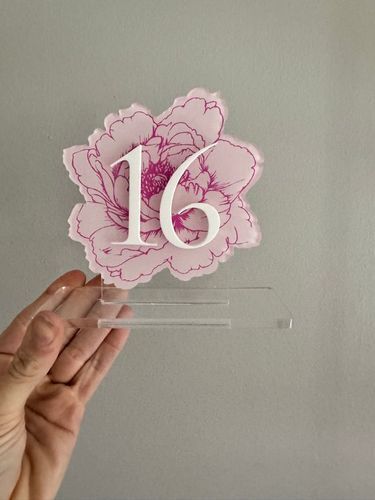
A stunning example of layered acrylic artistry — the peony was printed second-surface with white ink on clear acrylic, while the number was precision-cut from white acrylic and art-mounted to the front for a refined, dimensional effect.
How to Sell It to Clients
Here’s how to explain it simply to non-technical customers:
“We print the design in full color on both sides of a clear panel, with a layer of white ink in between. That white layer blocks light and keeps each side perfectly opaque, so it looks beautiful and solid from either direction.”
Use visuals when possible — a small 8×10 sample with one side masked off demonstrates the effect instantly.
Final Thoughts
Color–white–color printing represents the pinnacle of professional acrylic and glass printing. It delivers optical clarity, color consistency, and a level of finish that immediately communicates craftsmanship.
For resellers, mastering this technique does two things:
1. It expands your product range into the premium signage and architectural space.
2. It positions you as a consultant who understands advanced print engineering, not just pricing.
Because when you can confidently explain how light, color, and layering work together — you stop competing on cost and start competing on expertise.
That’s what transforms a print vendor into a print partner.